I have previously talked about the use of Technicolor and how the artwork shot in animation was adapted to its use on the screen.
This page has a document transcription from a 1936 Disney art class that explains just that. An example from the
upcoming auction can maybe clarify this a little, as well. Here are two versions of item #21, a background from the great "Mr. Duck Steps Out," the 1939 short of which I
posted the draft back in May 2006.
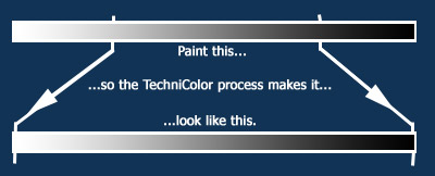
The left image is a regular scan of this wonderful background. What one notices is, that there is less contrast than one would expect to see in a movie background. I read in an explanation by Sam Armstrong (in a transcript I thought I had posted, but which seems to be on my to-do list) that the painters were asked to paint anything between around 25% to 75% of the color array. Technicolor would then stretch it out to from 0% (black) to 100% (white). Thus - no real whites and no real blacks; the painting gets a very elegant veil of low-contrast spread over it. Or graphically:
The right image is a "fake" I made in Photoshop: I noticed that the histogram had no peaks in left and right, so I stretched it using "Levels" which would do approximately what Technicolor did at least in its most basic form. We get a bright, very colorful image, which, if nothing else, I think goes to make my point.
Admittedly, the image on the left, the background as-is that is up for auction, would look prettier on my wall than the bright spray of colors I generated...
[This beautiful background did not sell at the auction!]


Very interesting, I didn't know that.
ReplyDelete"Auto contrast" in Photoshop will do the same thing faster.
ReplyDeleteHi Don - Thanks for your comment - you'd get the same effect, but that was not my point: I wanted to control the levels myself, not have Photoshop decide them for me....
ReplyDelete