
Colored Pictures
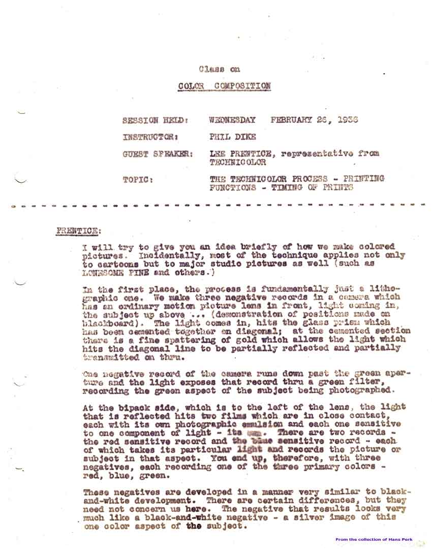
On Wednesday February 26th, 1936, three and a half years after Flowers and Trees, a representative of the Technicolor company named Lee Prentice explained the Technicolor process to the Class on Color Composition led by Phil Dike.
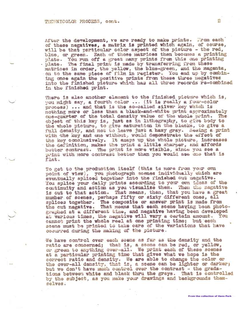
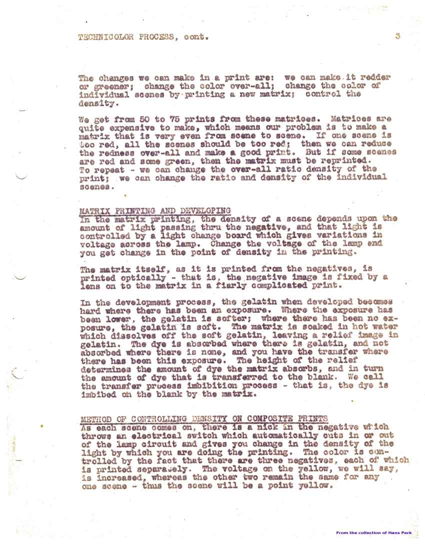
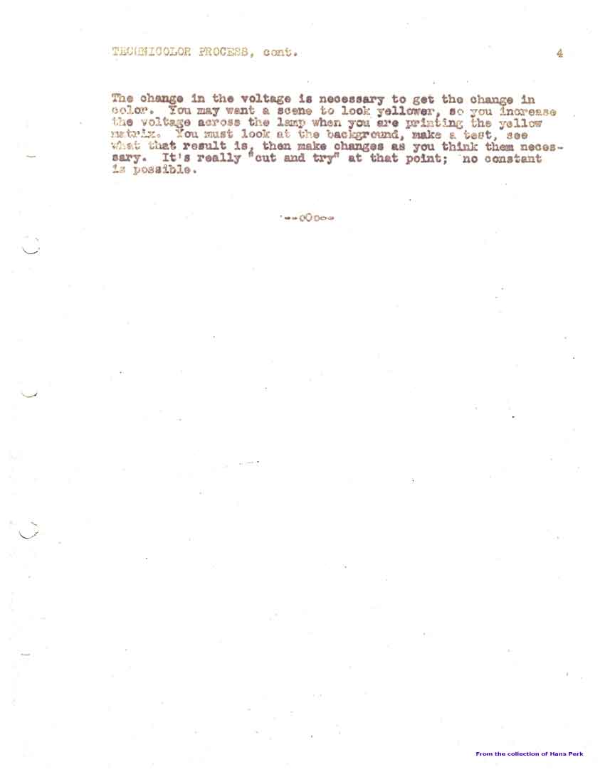
Here is the transcription of the talk, which not only explains the process of development and imbibition printing, but also notes which color timing corrections are available at which level...
A note: I love three-strip Technicolor, but I think it is worth noting that what you filmed normally was not what showed up on the screen. A clear example is Mary Poppins, where the costumes were designed by Tony Walton to look a certain way on film by not making them that color in real life. Thus, it was a severe mistake by the producers of the Anniversary DVD to correct the colors to look like the real surviving items, however well meant. (I hope they will be showing a film print at the Mary Poppins Sing-along at the El Capitan today!)
Another example: in the 1967 live-action musical The Happiest Millionaire, the characters wear seemingly light blue sweaters. In real life, they were neutral grey. (Though several were later dyed in colors for the Passamaquoddy sailors in Pete's Dragon.)
I seem to remember that in the Disney animation dept., a lot of research was done to map out how colors would show up on film, especially in this period where Snow White was beginning to take on color. I recall something about wall-charts after lots of tests.
Conclusion: there is more to Technicolor than meets the eye!
Here is the transcription of the talk, which not only explains the process of development and imbibition printing, but also notes which color timing corrections are available at which level...
 |  |  |  |
Another example: in the 1967 live-action musical The Happiest Millionaire, the characters wear seemingly light blue sweaters. In real life, they were neutral grey. (Though several were later dyed in colors for the Passamaquoddy sailors in Pete's Dragon.)
I seem to remember that in the Disney animation dept., a lot of research was done to map out how colors would show up on film, especially in this period where Snow White was beginning to take on color. I recall something about wall-charts after lots of tests.
Conclusion: there is more to Technicolor than meets the eye!
Labels: AAC
posted by Hans Perk at 5:00 AM
![]()
![]()

0 Comments:
Post a Comment
<< Home