Please note: if an earlier link doesn't work, it may have changed following an update! Check the Category Labels in the side-bar on the right! There you can find animator drafts for sixteen complete Disney features and eighty-six shorts,
as well as Action Analysis Classes and many other vintage animation documents!

Sunday, May 31, 2009

A MoCap Christmas Carol - Bah Humbug!

A week ago today I spent several hours in line to see the Christmas Carol Train Tour exhibit at L.A. Union Station. It marked the beginning of a national tour promoting the new film by Robert Zemekis made for Disney called A Christmas Carol, of course based on Dickens' famous book.
A Christmas Carol
The train exhibit seemed extremely well done. Reference costumes, clips, models and a cute photo opportunity. Best of all, there were original Dickens documents on display.
A Christmas Carol
Very popular but less impressive was the "morph yourself into the characters" setup. This last bit did have problems, though: it spoke of "morph yourself into one of four characters," but there were only three, as the female lead was not available. Also, the images have as yet not turned up in my email, I wonder if they ever will...[They did, Monday night, eight days after the event!] After the train exhibit, we got into a new line, this time for the inflatable theater. Oh boy...

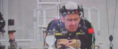
Ok, my main bone of contention: it is a Motion Capture production. They call it Performance Capture, but if this is the state of the art, I will still call it Motion Capture. Scrooge was captured from Jim Carrey, an actor who is not my personal favorite, but then I also do not enjoy much of Jerry Lewis.
A Christmas Carol
I found this clip on the web, and I must say it underlines my feelings about this method of film making...[Clip no longer available!]

The exhibit in the train showed clearly how this film was produced - pretty much like Polar Express. Now they do claim that "the eye problem is fixed." This only means that the characters seem to look at each other now - but their gaze is just as dead as before.

WHY do the characters need to be so ugly and unappealing? I doubt if we can ever feel anything for them. My favorite Christmas Carol adaptation is the 1971 musical film Scrooge with Albert Finney in the title role. Actually, the stage version with Tommy Steele I liked even better! Animated, I enjoyed Richard Williams' grand opus. Anyway, in Scrooge, you are really set up to like everyone, Scrooge, Marley, Fred, Ghosts - except maybe the Ghost of Christmas Yet to Come, but that is a small point.

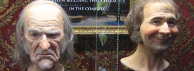
Let me give an example: in Scrooge, we find in Bob Cratchit a vulnerable man who does his best to support his family - he is likable - we WANT him to have a better life. In Zemekis' film, Bob Cratchit seems quite unlikable - Tiny Tim might even be ashamed to have such a wimp as a father! And Tiny Tim? To me he reeks of some young designer saying "hey guys, look how strange I can make this guy?" instead of finding the heart in the story. The models as displayed in the train show a lot of good intentions, but they seem to have a hard time pulling these things off on film!
A Christmas Carol
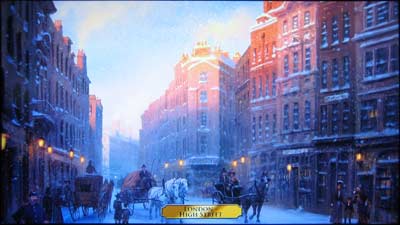
At the exhibit, in the balloon theater, a small film was shown in 3-d stereoscopic, with most of the scenes being inspirational art turned into View-Master® images. Mind you, the backgrounds of Old London are often breathtakingly realistic. Too much so for my taste.
A Christmas Carol
Only a few scenes were shown in a sort-of final stage, so we may need to give Zemekis the benefit of the doubt. On the other hand, the scenes shown were appallingly unappealing. When the nephew Fred visits Scrooge at the beginning of the story, he was captured from well-known, dependable actor Colin Firth, but who directed him to be irritating and ugly? Underneath his emotionless stare, he seems to be angry, not in a Christmas mood at all! As member of the audience, I felt just as Scrooge: get this guy out of here!
Good day to you, Sir!
If that is what I feel about the LIKEABLE characters, what will I think of the scary ones, or the ones I need to dislike?

The bit with Marley in the clip above shows that I will feel very little. There is hardly any expression. Scrooge seems to have one expression in this sequence, as well. None of the characters is actually THINKING! Why is Marley nodding mechanically as he says "you will be haunted by three spirits?" Now mind you, the music was REALLY LOUD in the theater. Maybe they think that that will make it all more scary?

Here is what *I* think they should have done, if they wanted to keep the MoCap: first get a performance that is based on really acting the part as needed to tell the story well, instead of just action, the moving of dots under the MoCap cameras. Then do as Milt Kahl did: use the live action input as a guide, not as a crutch. Look at it, look at what makes things special, throw stuff out that is superfluous (this part is standard MoCap practice, "cleaning" the data) and then CARICATURE the actions. Change them until they work. Do not just use what you have left after cleaning, because then you have what looks like rotoscoped live-action. Just a copy of a live performance is still and always will be just a copy. It can not, given the current conditions, give you all the nuances of a real live performance - for this you need to add the life back into it. Of course, you can only do this if you have animators doing this work, not data-moving technicians. I have seen Audio-Animatronic figures with more "soul" than the clips I have seen from "A Christmas Carol: An IMAX 3D Experience," and that is saying something. I am quite certain that The Illusion of Life is still in print!

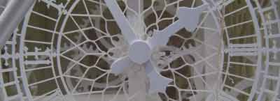
The film will show the building of Big Ben, the landmark London campanile that celebrates its 150th birthday right now.
A program about Big Ben might turn out to be more interesting...
A Christmas Carol
I thought the Christmas Carol Train Tour was a great exhibit. I, and everybody I was with at the time, loved the train. And we were all thoroughly disappointed by the clips shown in the theater. Will we see the film when it is released November 6th.? Heck yeah! We need to know if a great big Hollywood movie really can be THIS bad...

Go see UP! You will see a heartwarming, exciting story with stunning yet simplified backgrounds and above all great characters, well animated, appealing and full of heart! Without MoCap!

Labels: , ,

Friday, May 29, 2009

Things are looking UP


Returned from the D23 event "UP all night" at the El Capitan in Hollywood, where I saw PIXAR and Pete Docter's UP.

I loved it! It is a wonderful movie. I thoroughly recommend it, and I hope it does as well as it deserves!!
It has an interesting story with fun twists and surprises. Delightful, at times sinister, at times an action/adventure movie. I would say that, except for songs, this film has it all!
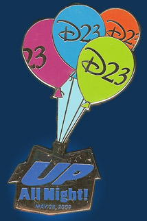
Pin given out at D23 UP event

The 3-d stereoscopic effect is nicely understated and is only used to help tell the story. The event itself was nice, too, though there was a good long wait first: in line 8:30 pm, doors opened at 10, film started at 11. Once inside we were welcomed by the organ music of Rob Richards, who played an hour non-stop, until the lights went down for a little welcome by D23-head Steven Clark and a nice talk by actor John Ratzenberger, who has the distinction to have voiced characters in all of the Pixar features. Then trailers, including a nice one for The Princess and the Frog, followed by a little live dance show. Then the very nice short film "Partly Cloudy," and finally the main feature. After ten minutes I clearly heard sobs from audience members!
Lots of laughs and cheers, too! Outside again at 1:30...

This event also proved that getting the D23 membership was a good idea, also price-wise, as this event was free - though the normal price including drink & popcorn would be $25, and one could bring a guest, that is $50! Plus the two magazines so far published $32 makes a total thus far of $82, which is less than the $75 membership! And, of course, everyone in the audience got a free event pin (and baloon). With two magazines yet to come and the Expo coming up, the membership has paid for itself already! It's not too late folks, you can still become member! D23 needs your support, so things can happen that probably never will happen again!

[Addition: hear Pete Docter on NPR as RealAudio or WMA!]

[Addition: the more cerebral reviewers point out some things they think are "wrong" with the picture, and I myself could do this around two-thirds in (when my thoughts begin to drift off I attribute it to a bit of dragging repetitivety and lack of clarity that encumbers most otherwise perfect PIXAR movies just over halfway through), but let's face it, I was genuinely entertained by UP, silly or not, and to me that is what counts! It happens so rarely these days...]

Labels: ,

Monday, May 25, 2009

From Columbia to United Artists...

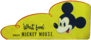
Not too long ago, I was lucky enough to be able to acquire this, the invitation to the party at the Disney Studio on Hyperion Ave. on June 25th, 1932 to finally celebrate the start of the distribution agreement with United Artists.

The celebration was just as much about the parting of ways with Columbia, with whom business had gone sour. As Roy Disney stated as early as in April 1930, they were not "overburdened with 'Good Intentions'." Though the deal was signed December 1930, and announced in April 1931, the Disney shorts were still delivered to, and distributed by Columbia until mid 1932, hence the late date of this party.

I especially like the wording, the down-home quality of Mickey's "dialogue" in this invitation. This is how Mickey should talk. If you who read this blog are, or are going to be a writer for Mickey, please realize that Mickey sounds best when he reacts, and remember to use as few words as possible! Now read this invitation, "and make it snappy!"
Yoo Hoo! Come Onn Over!<< Click to enlarge...
Though I only met Wayne Allwine very few times, I am certain he will be greatly missed, and my thoughts go out to Russi.

[Addition: if you do not know your Mickey history and are taken aback by Mickey's accent, hear it straight from Walt’s own mouth in the Mickey Mouse Theater of the Air here. This is how the Mickey in the invitation sounds - not like a slave at all: he is simply a straight-forward fun-loving country boy mouse with a no-nonsense attitude.]

[For those of you studying animation, remember to check out the many Action Analysis Classes, animator drafts and other documents you can find on this blog! Find out how they timed the short films at Disney, and download my free animation timing metronome!]

Labels:

Thursday, May 14, 2009

Mr. G.O. Graphic

When I visited the Disney studio lot in Burbank for the first time in 1978, I noticed a panel holding a row of nice shadow boxes with paper cutouts explaining the process of animation. I later learned that these were done by legendary Disney animator Bill Justice.

Originally situated just below eye level on the left of the entrance to hallway 1D in the Animation Building, the hallway of the Gods--or the Kings, depending on who is relaying the story (left image), it has since moved up one floor to just left of hallway 2A on the south-east end of the main corridor, a few inches lower than before, something that seems to reflect the sentiments of the company through the nineties. The wood paneling has also been painted white which can be seen in the right two images which I took last week.
123

The boxes are quite elaborate little works of art that explain the process of animation from story, sound recording, animation, ink & paint, background, camera and editing to projection. They were supposedly created to explain the process in a simple way to visitors to the studio, thereby making extended disruptions unnecessary.
1234
5678

It is very possible that you are familiar with the images, as the boxes were pictured in a Mondadori-originated comic album, and more importantly, they were based on artwork presented in the important August 1963 issue of National Geographic (left image), the magazine with the great article by Robert de Roos, a Stanford alumnus of the same year as Ollie Johnston and James Algar. The article has early images of Walt and a fun fold-out map of Disneyland, and also pictures of Walt's suite above the Disneyland Fire Station and two spreads of Mr. G.O. Graphic explaining the process of animation!
123
The artwork in the magazine as well as in the boxes use Archimedes from the 1963 feature film The Sword in the Stone as example.

Labels:

Tuesday, May 12, 2009

Iron Pencil Revisited

At last an image of the infamous Iron Pencil at work! Check out my previous post for details on the workings and patent drawings for this contraption!

Iron Pencil Session

Blog reader Gunnar Andreassen pointed out a whole new world of images on Getty Images, and while browsing these, I stumbled over the image of a sound re-recording session at the Disney studio, for the wonderful short film "Toot, Whistle, Plunk & Boom," dated September 1st, 1953!

Note how the gentleman in the center (maybe Jim MacDonald) points with his "iron pencil" which in turn gets the lights on the rail at the top to point at the same spot on the scores of the other gents, the mixers, who turn their dials according to their instructions--the spots are clearly visible on their scores!

[Addition:] More!
Iron Pencil Session
Iron Pencil Session

Labels:

Monday, May 11, 2009

Girls, Girls, Girls...

A few days ago, the prolific Michael Sporn posted a few drawings that originated with Jack Kinney, including a few pages of girls drawn by Fred Moore.

I noted in a comment that "All of the girls, except the very first one in Kinney’s caricature, are from the unofficial in-house publication “The Mousetrap” that was issued in 500 numbered copies in 1937 by “The Ward Ritchie Press.” Number 91 of these was reprinted as a facsimile in the late 70s. The original run had watercolors applied differently in each issue (by Ward and Betty Kimball, Ward Ritchie, a "Mrs. O.," and two guys, Webb and Pete). They were, of course, painted before the magazine was bound. Ward Ritchie was the publisher, his business pretty nearby at 1936 Hyperion Ave. while he lived at 2110 Griffith Park Blvd. (nearly back-to-back locations between Udell Ct. and Lyric Ave.). Ward Kimball was the main editor (perpetrator?) of this spiral-bound magazine.

To underline this, and for comparison, here are the two hand-colored pages, from two different original issues. I do not have the reprint of #91 close at hand, but I do remember that the two images below resemble each other more than they resemble this reprint, where the color application is concerned.
Mousetrap #268Mousetrap #312Mousetrap #91
1_2681_312 1_91
2_2682_3122_91

[Addition 04/2011: finally added images from the reprint of #91.]
[Addition 04/2014: corrections re: Ward Ritchie and info on the painters. Thanks, Amy!]

Labels:

Saturday, May 09, 2009

More on Once Upon a Time

The eminent historian Michael Barrier has recently posted an item about the fake Disney sighting in the 1944 film "Once Upon a Time."

What struck me in the whole issue is that I find that the office actually REALLY looks like Walt's formal office!

I have shamelessly stolen the screen grab from Mike's site, the left image below. Then, a triptych composed of one black and white photo taken during Walt's lifetime and two taken in 1968, and finally a plan of Walt's formal office in the Animation Building in Burbank, room 3H-1 which I recreated from photos. The office currently may still be hidden behind the walls in the Disneyland Opera House, if it is not already moved into the Disney Archives' storage in conjunction with the Great Moments with Mr. Lincoln recreation.

123

On the floor plan, the camera in the scene from Once Upon a Time sees the light red area, originating behind "Walt"'s left side. The three photos are taken in the direction of the three red arrows. Notice the round shape, possibly a speaker, in the left top of the screen grab? It is the same shape in the top of the left photo!

Furthermore, you see the side of Walt's grand piano, a sofa in a wood-paneled alcove with a table in front of it (implied by the big lamp), a vertical metal pole structure that seems to keep the overhang up - this goes through the side table of the sofa, then a door (closed in the grab) that went out to Walt's secretaries and finally a cupboard of sorts, in the grab with a vase on it. The angle on Walt's desk, the height of the room - all seem to be correct.

Did they actually use Walt's office??? This possibility seems hard to grasp, especially with the relationship that Columbia had with Disney, as explained by Mike Barrier. They would also have a hard time getting a camera in that confined space behind Walt's desk. Then again, would they really go to this much trouble to precisely recreate Walt's office, which was neither well-publicized nor accessible to the general audience, on a sound stage? Maybe it is shot against a rear-projection screen? Or a giant photo backdrop? The shadow of the lamp on the sofa does look a bit phony... What do you think?

The idea that Walt, in a suit, would sit in his formal office with the doors shut making calls seems odd to me - he would most likely be casually dressed in his working office next door - unless he was in a formal meeting, in which case he would not be making this call.
Well, ok, it is a movie after all...

[Remember that the event in Hemet is this afternoon at 3:00!]

Labels: ,

Thursday, May 07, 2009

Sounds Delightful

Be there or be square!
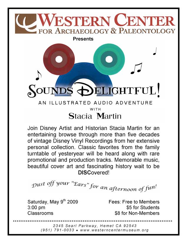
Remember to pop by the Western Center Museum in Hemet now Saturday 5/9/09 at 3:00 pm - the day before last of The Music behind the Magic exhibit - and "join Disney Artist and Historian Stacia Martin [author of the booklet in the new World's Fair disc set!] for an entertaining browse through more than five decades of vintage Disney Vinyl Recordings from her extensive personal collection. Classic favorites from the family turntable of yesteryear will be heard along with rare promotional and production tracks. Memorable music, beautiful cover art and fascinating history wait to be DISCovered!" I hope to see you there!
PDF 526 KB<< Click to open flyer as PDF...
                                       ... or as JPG! >>
JPG 541 KB
Prepare yourself for a true audible feast, with Disney goodies from the very beginning up to the 70s; well worth the trip to Hemet!

A note on The Music behind the Magic exhibit: this is the last time this exhibit is on the west coast. It will have a last run in Florida before retirement! So if you have not seen it and are not planning a trip to Florida, Sunday is your last chance!
                        Be there or be square!

Labels: ,